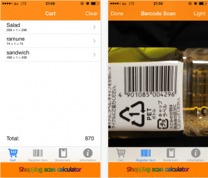
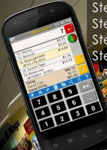
After having a name for my product, a logo created and also the general theme for it I decided it would be a good idea to start designing my app. As said in another post I want the to keep with a theme and so the colour scheme of blue and white would be dominant throughout. I also said I wanted to have a simple, easy to use app which the consumer would be able to use every day with no problems. I researched into some other similar products and looked at their designs and how they would work. I looked at an app called “Shopping Calculator – Grocery Calculator”. Although this app only really does half of what mine will do I was merely looking at inspiration for my design at this point, I noticed that the app was very basic, bland and overall boring and I got the feel that people using the app would get very bored easily and just not use it anymore. Another I looked at was called “Shopping scan calculator” again different to mine however the design of the app again was very boring and looked like the creators didn’t care about the customer, with basic font and basic everything it didn’t really stand out. Most of the app designs I looked at didn’t really do anything for me and I knew that I could really take the market by storm if I created not only a perfectly working app that does everything for the customer but also just a nice app to be on. Nobody wants to be looking at a boring app for 10-30 minutes people would simple get bored and delete the app.
I’m sure you will agree after seeing those images that nothing really stands out and they look very boring and corporate, not only this but the bottom image which is “Shopping Calculator – Grocery Calculator” actually looks quite complicated which is the complete opposite of what I am going for with my app.
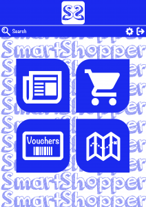
After taking inspiration and seeing what I did and didn’t want my app to look like I started to design the homepage of my app, I had to decide what I wanted it to look like and what tabs I wanted the app to have to help the user. After a few hours of juggling different ideas I finalised the home page of my app.
I decided on 4 main tabs the app would have, Newsfeed, Shopping, Vouchers and Map. These 4 areas each having their own tab allow the user to do different things on the app, like calculate how much their shop is going to be and where that certain shop is going to be cheapest, what vouchers could also save them even more money and where the closest supermarkets are to their current location. The design is clear and the user can easily tell what each tab is by the use of the icons so there is no confusion. With a base design for my homepage completed in the coming weeks I plan on creating each tab and having a finalised product design.


One thought on “Week 4: App Design”
In today’s era people have reached to mobile phone and most of the business are move themselves into online platform by publish android app to grab business from online bazar
prem