Week 6: Creating Assets

I wanted to start creating my final video for the project however needed to create the assets I was going to animate. I decided that I would use the app designs I created last week, animate those and incorporate the assets I made this week to get a combined video. I didn’t create storyboards or plan my video as I didn’t really know the exact direction I wanted to take the video in however I did have a general idea. I began creating assets that I thought would be good to use within the video and also be easy to animate.

arm bill dude11 mouse hand mouse thumb


These are just a few of the assets I created ranging from a small man and shit arm to a bill or receipt. Some of the images are copyright free stock images that I have then added to and made my own. Although i’m not 100% sure what I will use the assets for I do know they will be useful within my video.

Week 5: Finishing The App Design

After creating the homepage of my app and being happy with the design I wanted to get the app design finished. Sticking the basic design I had already created for the homepage I went on to create a separate design for each of the 4 tabs. This being quite a big task as I wanted to make something I was happy with I spent many hours on Photoshop chopping and changing little things about the design however by the end of the week I was happy with every tab I had created.

Newsfeed:

App news tab


Shopping 1/2:

Shopping tab shopping tab 2


Vouchers:

Vouchers tab


Map:

map tab


Overall I am very happy with the design, each tab communicates with the user easily and there is no confusion (or wont be) when its up and running. It covers all the bases that I proposed, I felt designing my product before conducting my RnD file was better for me as I was able to have a baseline, I had also done some research into other apps and what I wanted from mine so I felt this was the right move. These pieces would also be used as assets in my 30-60 second video about my app which is a walk through of how it works, why I want to create it and how it will help the user and having these designed will not only allow me to show the audience how the app will work but also get general feedback on the design and if anything needs to be taken out or put in.

Week 4: App Design

After having a name for my product, a logo created and also the general theme for it I decided it would be a good idea to start designing my app. As said in another post I want the to keep with a theme and so the colour scheme of blue and white would be dominant throughout. I also said I wanted to have a simple, easy to use app which the consumer would be able to use every day with no problems. I researched into some other similar products and looked at their designs and how they would work. I looked at an app called “Shopping Calculator – Grocery Calculator”. Although this app only really does half of what mine will do I was merely looking at inspiration for my design at this point, I noticed that the app was very basic, bland and overall boring and I got the feel that people using the app would get very bored easily and just not use it anymore. Another I looked at was called “Shopping scan calculator” again different to mine however the design of the app again was very boring and looked like the creators didn’t care about the customer, with basic font and basic everything it didn’t really stand out. Most of the app designs I looked at didn’t really do anything for me and I knew that I could really take the market by storm if I created not only a perfectly working app that does everything for the customer but also just a nice app to be on. Nobody wants to be looking at a boring app for 10-30 minutes people would simple get bored and delete the app.

Screen Shot 2016-03-10 at 19.14.44 Screen Shot 2016-03-10 at 19.15.08

I’m sure you will agree after seeing those images that nothing really stands out and they look very boring and corporate, not only this but the bottom image which isĀ “Shopping Calculator – Grocery Calculator” actually looks quite complicated which is the complete opposite of what I am going for with my app.

After taking inspiration and seeing what I did and didn’t want my app to look like I started to design the homepage of my app, I had to decide what I wanted it to look like and what tabs I wanted the app to have to help the user. After a few hours of juggling different ideas I finalised the home page of my app.

App homepage

I decided on 4 main tabs the app would have, Newsfeed, Shopping, Vouchers and Map. These 4 areas each having their own tab allow the user to do different things on the app, like calculate how much their shop is going to be and where that certain shop is going to be cheapest, what vouchers could also save them even more money and where the closest supermarkets are to their current location. The design is clear and the user can easily tell what each tab is by the use of the icons so there is no confusion. With a base design for my homepage completed in the coming weeks I plan on creating each tab and having a finalised product design.

Week 3: Logo/App Name

As I had decided to create an app a logo is a key part to its success. As I wanted to aim the app at students because of bad student loans and some students having to take out huge overdrafts and loans just to get by I thought my app would help them the most but of course the app is for everyone. I wanted a simple, easy on the eye and memorable logo which would in turn fit with the whole ‘theme’ of the final finished product. After deciding that “SmartShopper” was a fitting title for the app I ran with that and began to think of ideas for the logo.

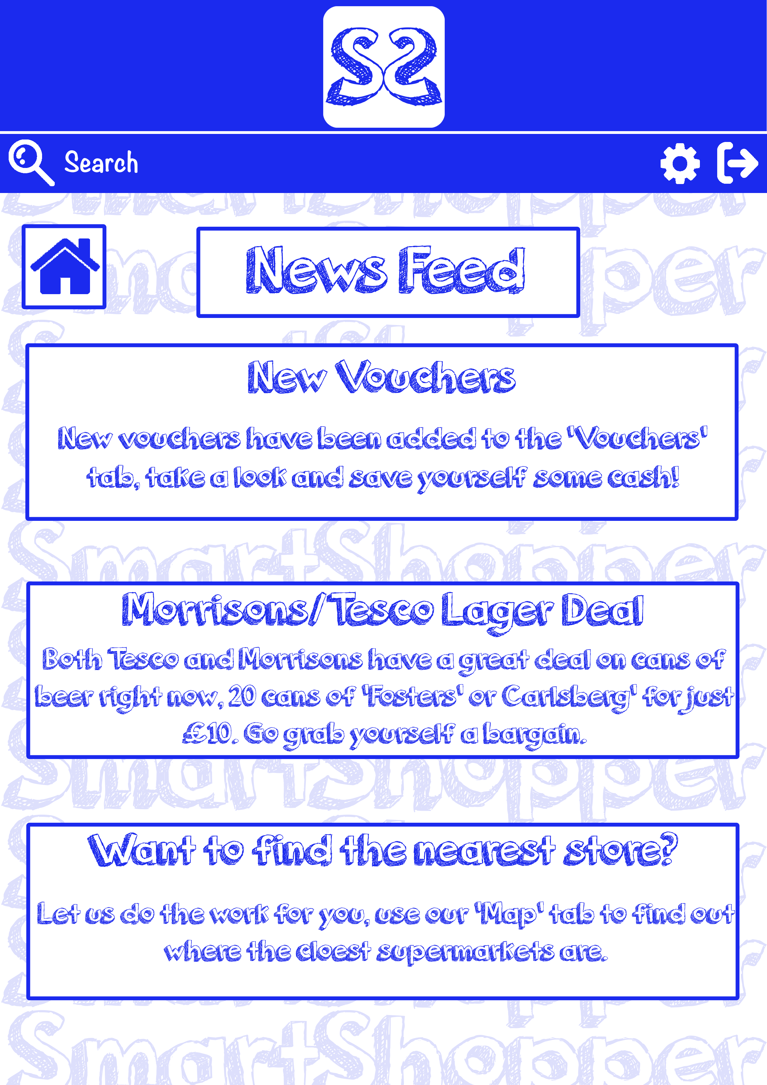
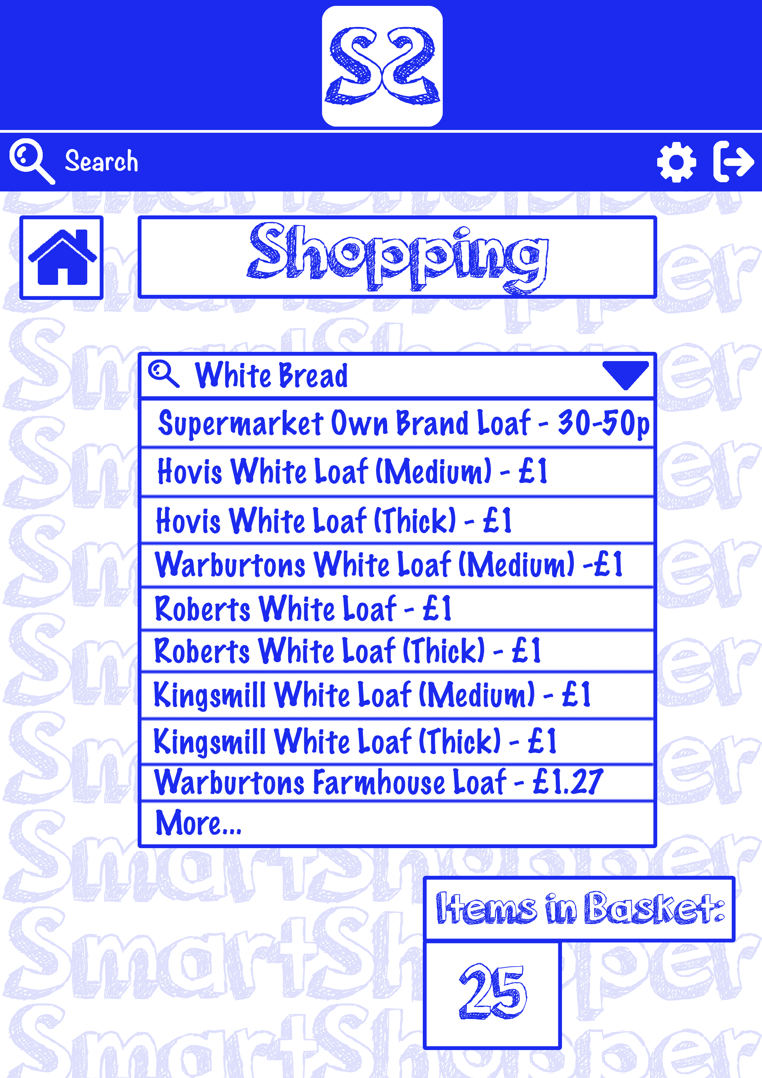
I wanted a clear colour scheme, by having this its easy on the eye for the customer/audience not confusing them or having to figure out what the actual logo is or trying to represent and having too much going on a logo people can be put off easily. Blue and white seems to be a fairly dominant colour scheme, if we look at Facebook and Twitter for example, it’s familiar for the audience.

I didn’t want anything too serious, this isn’t an app about finding you a job, or helping you further your career or helping you sort out your credit score. It’s a laid back app that can save you money on your shopping bill (which everyone wants) so I wanted to stay away from the corporate looking logos which we see everyday like HSBC or Natwest. It merely has to be recognisable to the audience so they instantly know who the logo belongs to.

After taking all this into consideration and playing around on Photoshop with a few different ideas I came up with what I feel is a simple and effective logo/title, no messing around and straight to the point.

Shopping App


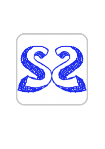
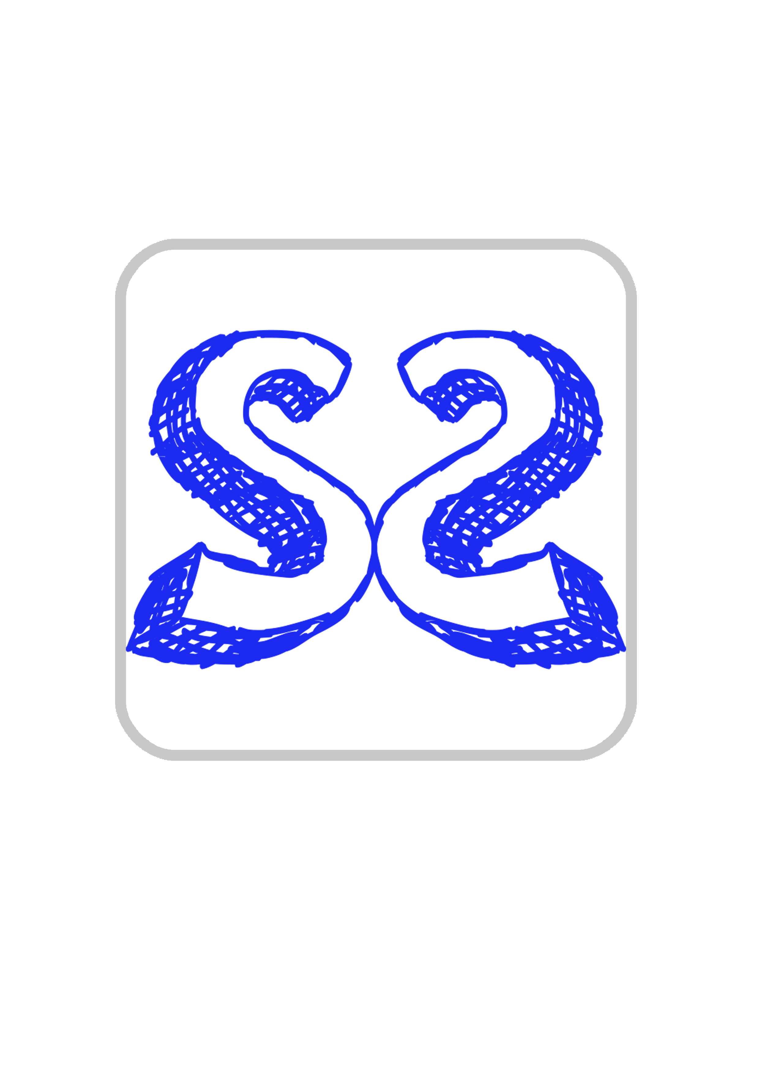
I have taken the two “S’s” from SmartShopper and put them together with a simple colour scheme, not only this but the top of the two letters make a heart like shape connoting the app is for the customer and the company does actually care about saving them as much money as possible (which we do). Simple and easy to remember which is exactly what I was going for.

In terms of the ‘Title’ I simply used the same font I used to create the logo, keeping to the theme of the app/company.


Title


Week 1/2: Proposal

After thinking of my initial idea within the first week I began some small background research (into similar ideas) to see if there was a gap in the market for the product I am proposing to make. After seeing there was a gap in the market for my product I started to finalise what I wanted to do, deciding on an easy and simple to use app. I finalised what I wanted the app to do and started to look at similar apps, taking not only some inspiration but also looking at how I could make mine different from all the others and stand out to dominate the market.

Proposal